
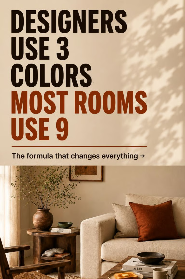
Okay, let’s talk about the color palette for living room styling because most people are getting this wrong, and it’s not their fault.
In most cases, the advice is either too vague or too technical. As a result, neither helps when you’re standing in a paint aisle holding seventeen swatches and feeling completely lost.
However, the rooms that look expensive are not running on more colors than yours. They’re usually running on fewer. Three, usually, and almost always in a specific proportion.
Your living room colour palette doesn’t need more options. It needs a structure, and the 60-30-10 rule gives you one.
Why Your Living Room Colors Don't Feel Cohesive
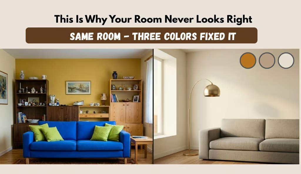
More color palette ideas won’t fix the real problem. In most cases, the issue isn’t that you’ve chosen the wrong colors. It’s that you’ve chosen too many, and none of them has a clear role.
Look around your living room and count the distinct colors you can see in the walls, sofa, rug, cushions, curtains, and shelving.
When several colors are competing without a clear hierarchy, your eye keeps moving because there is nowhere obvious for it to rest. Even expensive furniture can look less refined when everything is asking for attention at once.
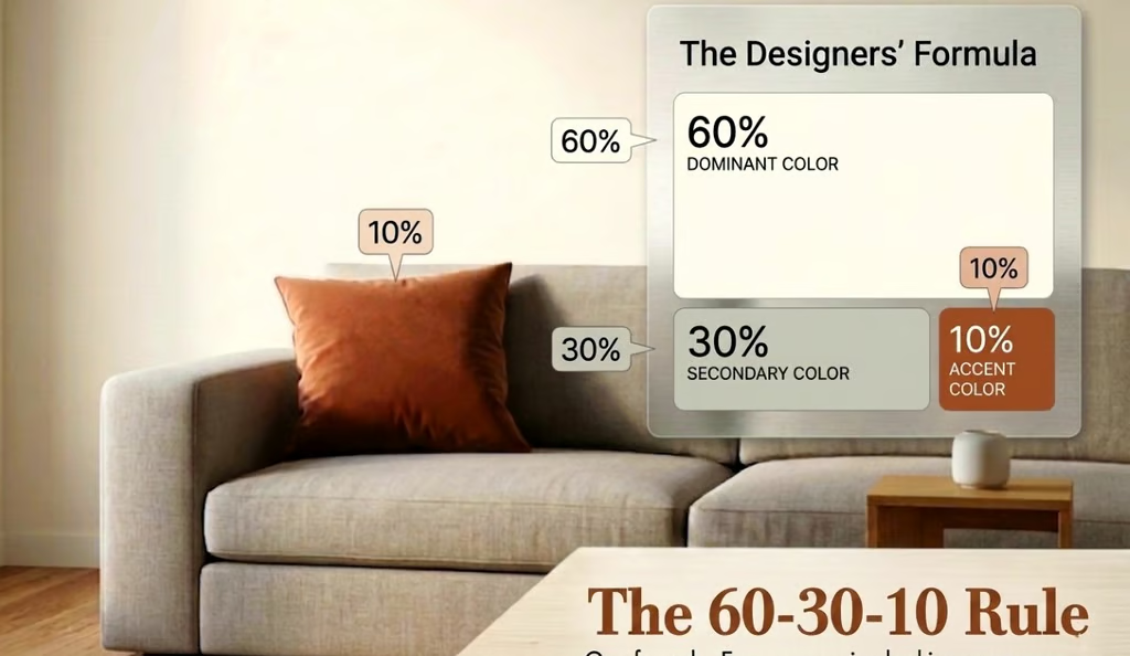
A well-designed color palette for living room spaces is usually built around three colors, and occasionally four, arranged in a clear proportion.
The easiest way to think about it is:
- 60% dominant color
- 30% secondary color
- 10% accent color
Because each color has a defined role, the room feels calmer and more balanced. This simple structure is also what makes many of the beautiful living room color palettes you’ve saved easier to recreate.
How to Build a Color Palette for Living Room Using the 60-30-10 Rule
The 60-30-10 rule is one of the simplest ways to create a color palette for living room that feels balanced without making every item match.
60% Dominant
This is the color your room lives in. It usually appears on the walls, main sofa, or largest rug.
Choose something you can comfortably live with every day, not just something that looks good in perfect lighting.
30% Secondary
This is where you add more depth and personality through curtains, an accent chair, secondary furniture, or another large visual element.
Keep the undertone compatible with the dominant color. A warm dominant color paired with a distinctly cool secondary tone can make the room feel disconnected even when both colors look good separately.
10% Accent
This is your opportunity for contrast.
Use it for cushions, throws, lamps, artwork, or smaller decorative accessories. One clear accent usually has more impact than several competing accent colors.
A simple way to choose your proportions
Start with the largest existing surface → choose the supporting color → add one accent.
For example:
Warm cream walls → taupe sofa → aged brass accents
or
Cream walls → sage curtains → natural linen details
The proportions don’t need to be mathematically exact. Think of 60-30-10 as a visual guide rather than a strict decorating formula.
The Best Living Room Color Palettes for 2026
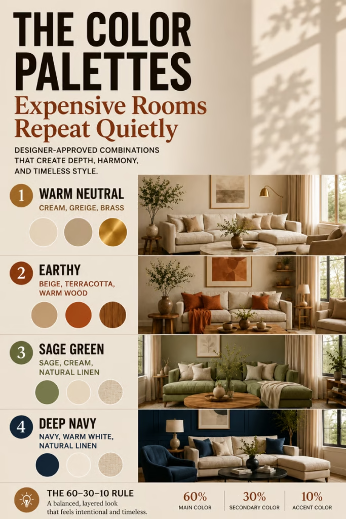
The strongest color palette combinations right now are not necessarily the ones that follow a short-lived trend. The more useful choices are palettes with structural logic, where the colors share enough tonal DNA to feel cohesive while still creating depth and contrast.
Here are four combinations that are easy to work with.
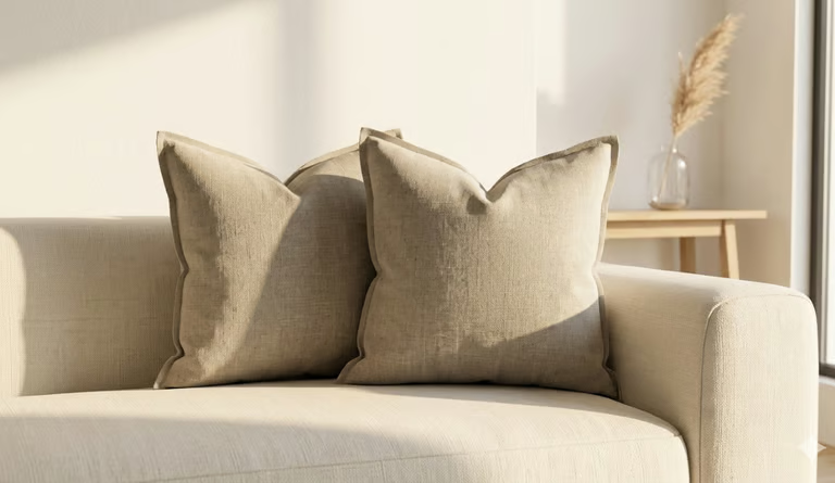
Warm Neutral Palette: Cream, Greige, and Brushed Gold
The neutral color palette for living room spaces is one of the most versatile options because it gives you plenty of room to change furniture and accessories later.
60%: Warm white or greige
30%: Deeper taupe or warm greige
10%: Brushed gold or aged brass
Use the warm white or greige on the walls and main furniture. Then bring in the deeper tone through curtains or an accent chair. Finally, use brushed gold or aged brass in smaller details such as a lamp base, mirror frame, or side table leg.
One important distinction is the wall color. Warm white usually works better here than stark white because it feels softer and is more forgiving of changing light and wall imperfections.
This is one of the most reliable paint colors that make room look expensive because the warmth adds depth without making the palette feel complicated.
Earthy Palette: Beige, Terracotta, and Warm Wood
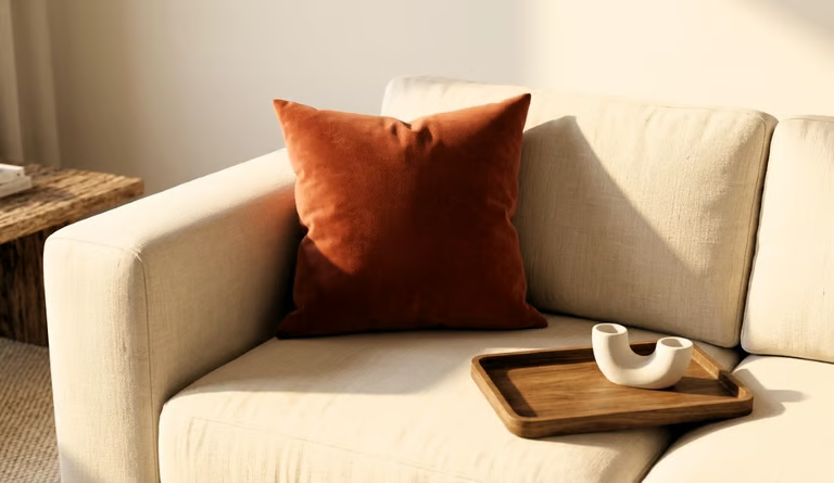
The earthy color palette living room is a strong option if you want warmth without making the room feel overly styled.
60%: Cream-beige
30%: Terracotta
10%: Warm wood
These three elements share the same underlying warmth, so they sit together naturally without needing identical tones.
This is also one of the most accessible combinations for renters because none of it requires paint.
Try:
- A terracotta cushion
- A warm wood tray
- Cream curtain sheers
You can shift a cold white rental room toward this palette without changing the walls.
→ Easy starting point: One terracotta velvet cushion on a cream sofa may be enough to introduce the palette without redecorating the entire room.
Sage Green Palette: Sage, Cream, and Natural Linen
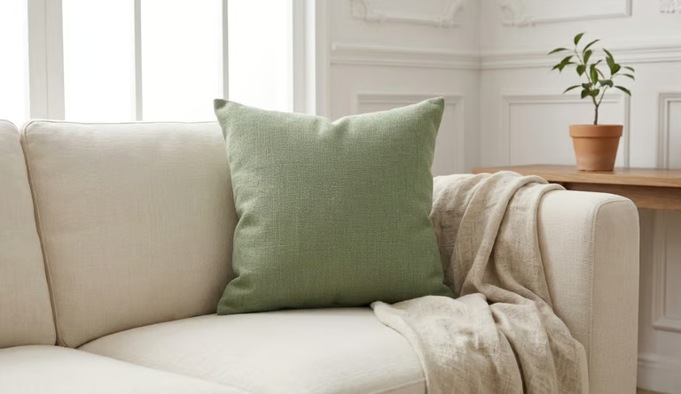
The sage green living room color scheme works especially well if you want color without the room feeling heavy.
60%: Cream
30%: Sage
10%: Natural linen
Use cream for the walls and main furniture. Then introduce sage through an accent wall, sofa, or floor-length curtains. Finish with natural linen through throws and cushion covers.
The result is calm without feeling flat. The warm neutrals keep the sage from becoming too cool or clinical.
Deep Navy Palette: Warm White and Natural Linen
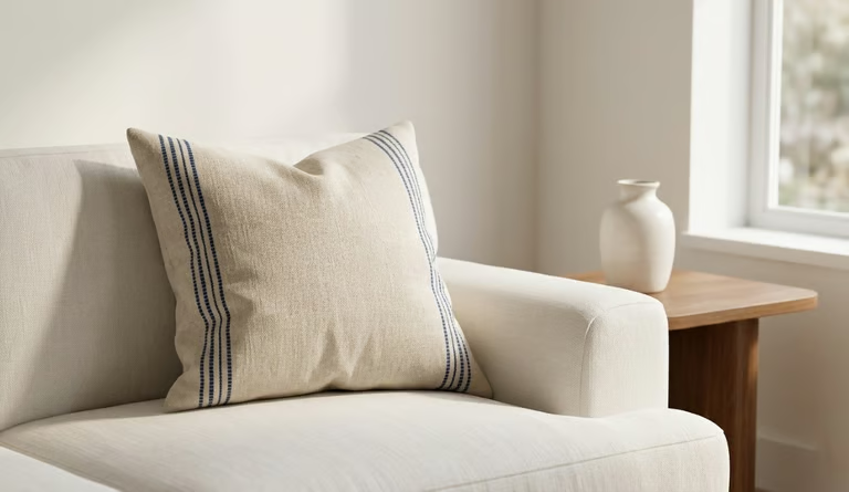
This is the boldest option on the list, and it’s also the one people often avoid for the wrong reasons.
60%: Warm white
30%: Deep navy
10%: Natural linen texture
Deep navy against warm white feels sophisticated rather than overly dramatic. The linen softens the contrast and keeps the combination feeling residential.
This palette works best in rooms with reasonable natural light.
If your room is consistently dark: Keep navy at the 10% accent level instead of using it as the secondary color.
→ Easy starting point: Navy and linen in one piece, can introduce the combination for a living room without requiring a full styling overhaul.
Living Room Color Ideas: What Is Replacing Grey in 2026?
Grey dominated home color palette ideas for more than a decade. However, it’s being replaced not by one single color, but by a broader move toward warmth and texture.
The colour palette living room 2026 shift is toward soft greige, sage green, and terracotta. All three can work with warm neutrals while still giving the room some depth.
Two colour combination for living room walls are particularly useful if you want to update a room without repainting everything:
- Terracotta below a dado rail with warm white above
- Deep sage on a single accent wall with cream elsewhere
If your room currently runs on cool grey, you don’t necessarily need to repaint first.
Try this order:
Cool grey room → warm the accent layer → assess the room → repaint only if needed
Start with terracotta cushions, aged brass hardware, or warm wood objects. These smaller changes can shift how the grey reads without committing to a new wall color.
If you’re working with a compact space, the right colours matter even more because visual flow affects how large a room feels. Our guide on how to style a small living room explains the layout, lighting, and styling techniques that make a room feel noticeably larger.
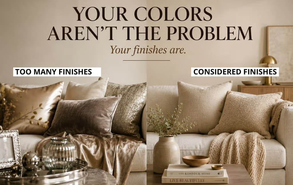
The Mistake That Ruins Any Living Room Color Scheme
You can have the right colors and the right 60-30-10 proportion and still end up with a room that feels unsettled.
The problem can be the finishes.
Glossy cushion fabric next to matte linen, velvet, and plastic creates visual noise even when all the colors belong to the same family.
For most palettes, a simple approach works better:
- Dominant color: matte or lightly textured
- Secondary color: matte or textured
- Accent color: this is where you can introduce some shine
You don’t need every surface to have the same finish. The goal is to make the finishes feel related rather than letting every object compete for attention.
When shine appears selectively, it becomes an accent instead of another source of visual noise.
Before You Choose Your Living Room Colors
This is not really a shopping decision, it’s a structural one.
Get the 60-30-10 proportion right first because a color palette for living room only works when the major purchases support the same structure.
Before buying anything, ask:
- What is my 60% color?
- What will carry the 30%?
- What is my single 10% accent?
- Do the undertones work together?
- Am I introducing another color because the room needs it, or because I simply like the item?
The expensive looking room colors you’ve been saving aren’t necessarily expensive. They are usually disciplined. One dominant color, one secondary color, and one accent color are repeated consistently across the room.
That discipline is free.
The right plants for home decorcan also complete a warm neutral palette without competing with it. See how to use them without making your room look random.
FAQ
What are the most popular colors for a living room in 2026?
Warm whites, greige, sage green, and terracotta are strong choices for a current living room because they work well with the broader move toward warmer, more layered interiors. They also give you flexibility when choosing furniture, wood tones, and accent colors.
What color palette makes a room look bigger?
Light dominant warm white, cream, and pale greige can help a room feel more open, especially when the wall color and larger furniture pieces have a similar visual weight.
For a full breakdown of small living room color palette rules that make space feel twice the size, see our [small living room styling guide →].
Can I create expensive looking room colors on a budget?
Yes, expensive looking rooms are not necessarily expensively furnished. They are usually tonally disciplined.
Try two changes first:
- Swap cold-toned accents for terracotta, aged gold, or warm cream.
- Replace one overly glossy finish with matte linen or another soft texture.
You don’t need to change the entire room at once. Budget isn’t necessarily the barrier, proportion is.
What is a good home color palette idea if I am starting from scratch?
Start with warm neutral cream or greige walls as your base. They work with a wide range of furniture colors, wood tones, and metal finishes.
Then build outward:
60% base → 30% supporting color → 10% accent
Starting with a flexible base gives you more freedom to change the room later without having to replace everything.