
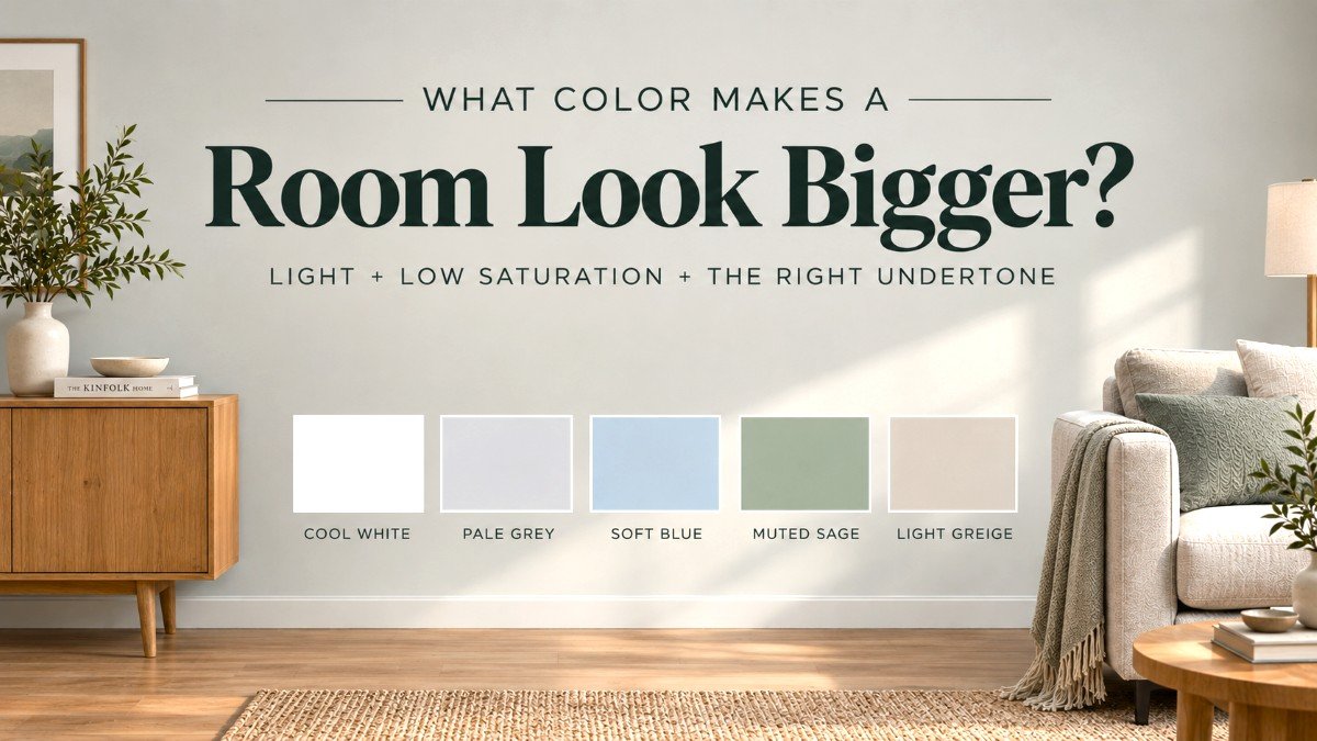
The what color makes a room look bigger question usually comes down to light, saturation, and undertone. The easiest starting point is a light, low-saturation colour with a balanced or cool undertone. Good options include cool white, pale gray, soft blue, muted sage, and light greige.
But white is not automatically the best choice.
The right color depends on your room’s natural light, direction, and the paint’s undertone. A shade that makes one room feel bright and spacious can look flat, yellow, or heavy in another.
Quick Guide: Which Colour Should You Try?
| Your room | Best colours to try | Test carefully |
|---|---|---|
| Dim or low-light | Cool white, pale grey, soft sage | Yellow-based whites |
| North-facing | Blue-grey, muted green, cool white | Strong cream tones |
| Bright and sunny | Soft white, balanced greige, warm neutral | Very cold whites |
| Small but well-lit | Pale blue, soft sage, light greige | Highly saturated colours |
There isn’t one universal shade. The best paint colour is the one whose undertone works with the actual light your room gets.
Why Light Colors Make a Room Feel More Open
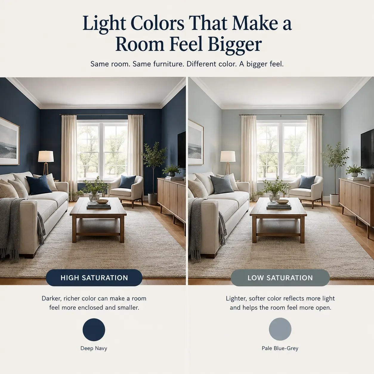
Light colors generally make walls feel less visually heavy because they reflect more of the light already available in the room.
Paint cannot increase a room’s physical size; it can only change how open, continuous, or visually heavy the space feels.
Pale blues, soft greens, cool greiges, and similar low-saturation shades can also recede visually, helping the walls feel less close.
Three things matter when choosing a light color
- Value: how light or dark a color is
- Saturation: how intense or muted a color is
- Undertone: the subtle color underneath the main shade
For making a small room feel more open, a light value with low-to-moderate saturation is usually easier to work with than a vivid, highly saturated shade.
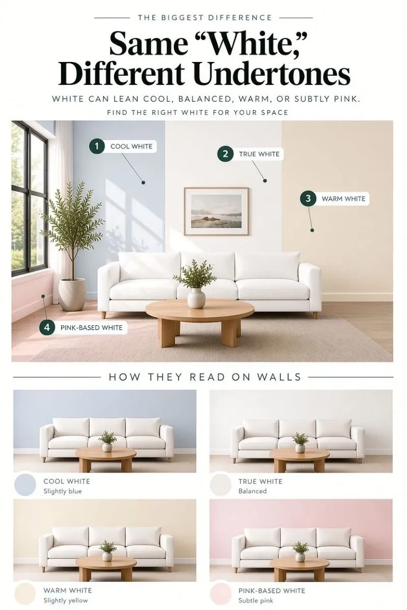
The catch is the undertone. A white with a strong yellow or pink base may look warmer and heavier in a dim room, even though the paint itself is very light.
The Undertone Matters More Than the Color Name
A paint label can tell you that a shade is “white,” “gray,” or “neutral,” but it doesn’t tell you exactly how that color will behave in your room.
Two whites can look completely different once they’re on the wall:
- One may have a yellow or pink base
- Another may lean blue or green
In a dim room, those subtle differences become much easier to notice.
That’s why the safest approach is to judge the actual undertone in your room rather than choosing a shade based on its name alone. The same paint can look soft and balanced in one space and noticeably warmer or cooler in another. When choosing what color makes a room look bigger, the undertone matters just as much as how light the shade looks.
Simple rule: Don’t choose a small-room paint color by the color name alone. Look at how its undertone works with your room’s natural light.
What Colors Make a Room Look Bigger Besides White?
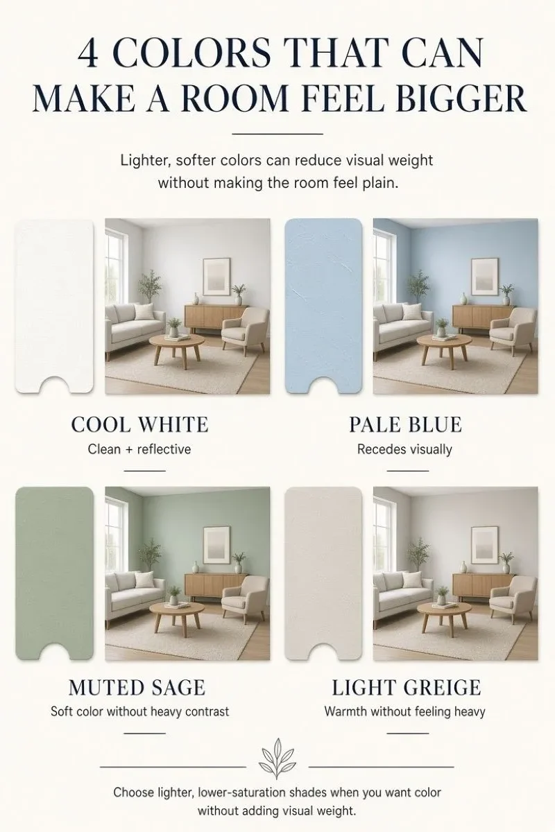
So, what colors make a room look bigger besides white? There are several softer shades worth considering.
The colors that make a room look bigger tend to be light and low in saturation rather than tied to one specific hue. Pale shades can feel more open, while highly saturated versions can draw more visual attention to the walls.
Some options worth considering:
1. Soft blue
Soft blue can recede visually while adding more personality than plain white.
2. Muted sage green
Muted sage brings in color without the intensity of a deeper green.
3. Cool greige
Cool greige is useful if pure white feels too stark but you still want a light neutral.
4. Warm off-white
Warm off-white adds a little warmth without a strong yellow cast, particularly in rooms with enough natural light.
5. Try a monochromatic scheme
If you’re comparing what colors make a room appear larger, look at the overall tonal relationship rather than the wall color alone.
Keeping nearby surfaces visually connected can make the space feel more continuous. Your eye moves around the room more easily when there are fewer strong visual breaks, so the room can feel more open even though its actual dimensions haven’t changed.
If you’re deciding how to paint a room to make it look bigger, keeping the ceiling and trim close in value to the walls can help create that continuity and reduce strong visual boundaries.
How to Make a Small Room Look Bigger
Wall color isn’t the only thing affecting how spacious a room feels. If you’re wondering how to make a room seem bigger, ceiling color and trim can either reinforce the effect or introduce more visual boundaries.
a. Keep the ceiling visually connected
A ceiling that is close in value to the walls can make the room feel more continuous.
A very light ceiling can also help maintain a sense of height, particularly when the walls aren’t dramatically darker.
b. Reduce strong trim contrast
Trim creates another visual boundary.
- Walls and trim close in tone: softer, more continuous look
- Bright white trim against colored walls: stronger outline and more contrast
That contrast can highlight architectural details beautifully, but it can also make a small room feel more visually divided.
If you’re still deciding on the rest of the palette, the full color palette guide covers how the wall, trim, and accent colors work together once this base shade is picked.
How to Test an Undertone Before You Commit
Don’t judge a paint color only in the store or on a screen.
Test it in your actual room, because the surrounding light and surfaces can change how the color looks.
Once you know what color makes a room look bigger, the next step is testing that color in your actual space before committing to it.
1. Use a movable sample
Paint a sample board or use a peel-and-stick paint sample rather than judging a tiny patch on the wall.
A movable sample lets you compare the same color in different parts of the room.
2. Check it in different areas
Hold the sample:
- Near a window
- Against another wall
- In the darkest corner
You’re looking for how the undertone changes, rather than whether you like the color in one particular spot.
3. Check it at different times of day
Look at the sample in:
- Morning
- Midday
- Evening
Pay attention to how the color changes as the natural light shifts.
4. Judge it in the weakest light
If the sample starts looking chalky, yellow, or muddy in the darkest part of the room, that undertone is likely to become more noticeable once the color covers every wall.
Peel-and-stick samples can help
If you don’t want to paint sample boards, peel-and-stick paint samples are useful because you can move the same color around the room and compare it against different walls and lighting conditions.
They’re especially helpful when you’re testing several undertones side by side.
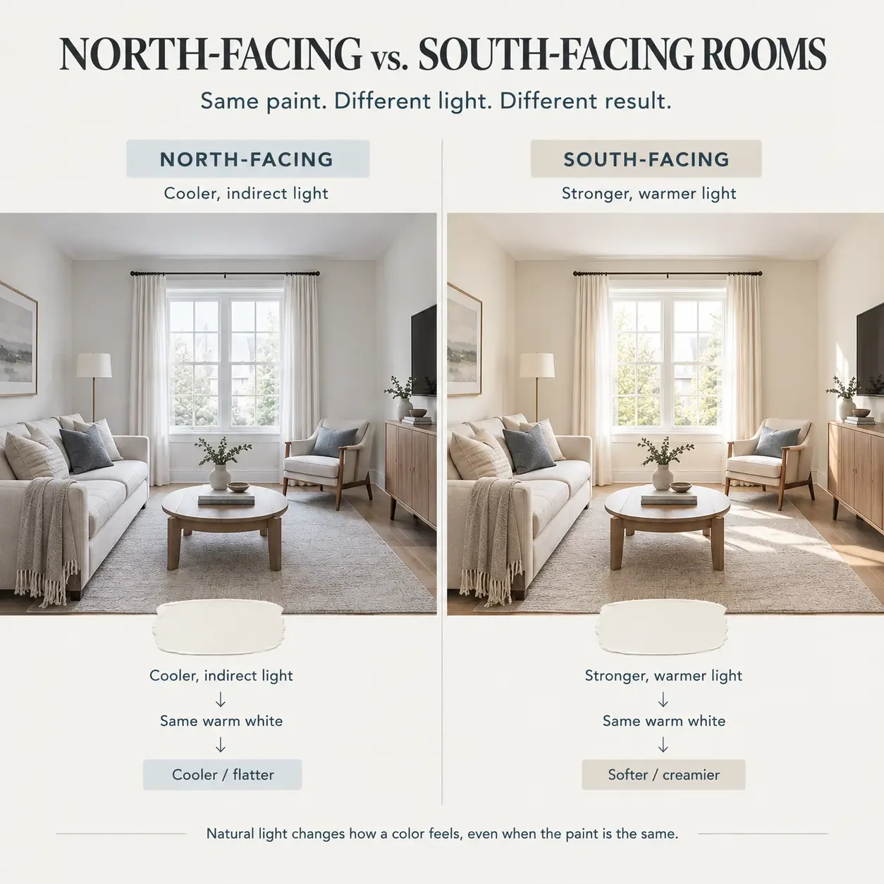
North-Facing vs. South-Facing: Why the Same Color Reads Differently
In the Northern Hemisphere, south-facing rooms generally receive stronger direct sunlight, while north-facing rooms tend to receive cooler, more indirect light.
However, room direction is only a starting point.
Window size, trees, nearby buildings, season, and local climate can all change the effect.
a. North-facing rooms
Cooler, indirect light can make warm paint colors appear flatter or grayer.
Colors worth testing include:
- Blue-gray
- Muted green
- Cool white
- True white
If your room is north-facing or doesn’t get much direct sun, be cautious with strongly cream-based whites.
b. South-facing rooms
Stronger sunlight can make warm colors appear brighter and more intense.
Colors worth testing include:
- Warm white
- Balanced greige
- Soft warm neutrals
A warm white that looks soft and creamy in a bright south-facing room can appear flatter in a north-facing room because the cooler light doesn’t counterbalance the warmth in the paint in the same way.
Colors That Tend to Backfire in a Small Room
Some colors aren’t necessarily bad, but they become harder to work with when the room is already short on light or visual space.
1. Warm, yellow-based whites
In low-light rooms, they can sometimes read dingy rather than airy.
2. Deep, saturated colors
Deep jewel tones such as burgundy or navy can make a room feel more enclosed when there isn’t enough light to balance them.
3. Stark, cold whites
In rooms with almost no natural light, very cold whites can look sterile and flat rather than bright because there isn’t enough light hitting the walls to make the coolness feel intentional.
4. Dark colors can still work
That doesn’t mean dark colors are automatically wrong.
If your priority is maximum visual spaciousness, light colors are usually the easier choice.
Dark colors can still work when your priority is atmosphere, depth, or a cocoon-like feel, especially in a well-lit room with:
- Strong architectural features
- Good lighting
- Consistent color treatment across the walls and trim
The difference is whether the color is being used deliberately and whether the room has enough light to support it.
Quick Checklist Before Choosing a Paint Color
- ☐ Light level: Judge the colour in the room’s weakest natural light, not only beside a sunny window.
- ☐ Undertone: Look for unwanted yellow, pink, blue, or green tones that become obvious once the paint is on a larger surface.
- ☐ Saturation: Softer, less intense colours generally create less visual weight than highly saturated shades.
- ☐ Trim contrast: Keeping the trim close in tone to the walls can reduce hard visual boundaries.
- ☐ Sample size: Use a movable sample large enough to see the colour properly, and check it in several parts of the room before buying the full tin.
FAQ
What color makes a room look bigger?
Light, low-saturation colors with the right undertone for your room’s natural light generally work best.
Good starting points include:
- Cool white
- Pale gray
- Soft blue
- Muted sage
- Light greige
There isn’t one universal shade, since a warm white in a dim room can look less open than a cooler, more balanced shade.
What is the best paint color for a dark small room?
No, white only helps if its undertone works with the room’s natural light.
A warm white in a room with little natural light can look dingy rather than open, while a balanced or cool white may feel brighter and more spacious.
Should the ceiling be the same color as the walls?
Often yes, keeping the ceiling close in color or value to the walls can reduce visual boundaries and make the room feel more continuous.
A very light ceiling can also help maintain a sense of height, particularly when the walls aren’t dramatically darker.
Can dark colors ever make a small room look bigger?
Yes, although it is less common.
Dark colors can make a small room feel intentional and cocoon-like when the room has good lighting, strong architectural features, and a consistent color treatment across the walls and trim.
They are not usually the easiest choice when the main goal is to maximize the feeling of spaciousness.
What to Do After Choosing Your Wall Color
Once you’ve found a wall color that works in your room’s actual light, the rest of the palette becomes much easier to build. If you’re still figuring out how to make a small room look bigger, keeping the trim and accent colours visually connected can help carry the effect through the rest of the space.
From there, use the full color palette guide to choose trim and accent colors, then consider mirror placement if you want to bring more reflected light into the space.